G&W Suites: Condominium Branding and Print Design
Brand identity development and print production for a fictional Toronto condominium.
Role
Project Manager/Designer
Industry
Hospitality/Real Estate
Timeline
Academic project (1 month)
Project Overview
G&W Suites is a fictional condominium building located in Toronto’s Distillery District. The goal of the project was to create a cohesive brand identity and various print collateral that reflected the areas historical roots while appealing to a modern, local demographic.
Context and Problem
The Distillery District has a strong cultural identity shaped by its industrial history, vibrant entertainment, and artisanal businesses. In the main pedestrian alley, Trinity St., there is a major emphasis on the history of the whiskey company Gooderham & Worts (G&W). Regarding the condominiums in the area, many of the developments felt very disconnected from the area entirely.
Design challenge:
How might we create a condominium brand that feels luxurious and contemporary while still acknowledging the history of the Distillery District?
Research & Design Direction
Our initial research focused on three main areas:
• The history and visual language of the Distillery District
• The Gooderham & Worts whiskey brand
• Competing condominium brands in Downtown Toronto
This research revealed an opportunity to create a brand that referenced the Distillery District subtly, allowing residents to feel connected to the area without relying on literal or themed visuals.
Aesthetics & Moodboards
After establishing the creative direction for our project, we began with a moodboard influenced by the whiskey imagery.
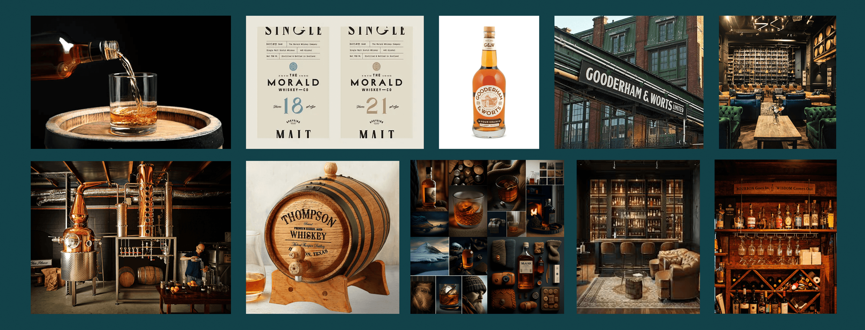
While the moodboard helped establish an initial direction, it ultimately became a starting point rather than the final destination. As our ideas evolved, we realized that literal whiskey references risked overpowering the condominium identity.
Logo Design Process
While I was not the primary designer responsible for sketching and executing the final logo, I contributed to concept development, critique, and decision-making throughout the iteration process. My focus was on guiding direction, evaluating scalability and clarity, and ensuring the logo aligned with the broader brand strategy.
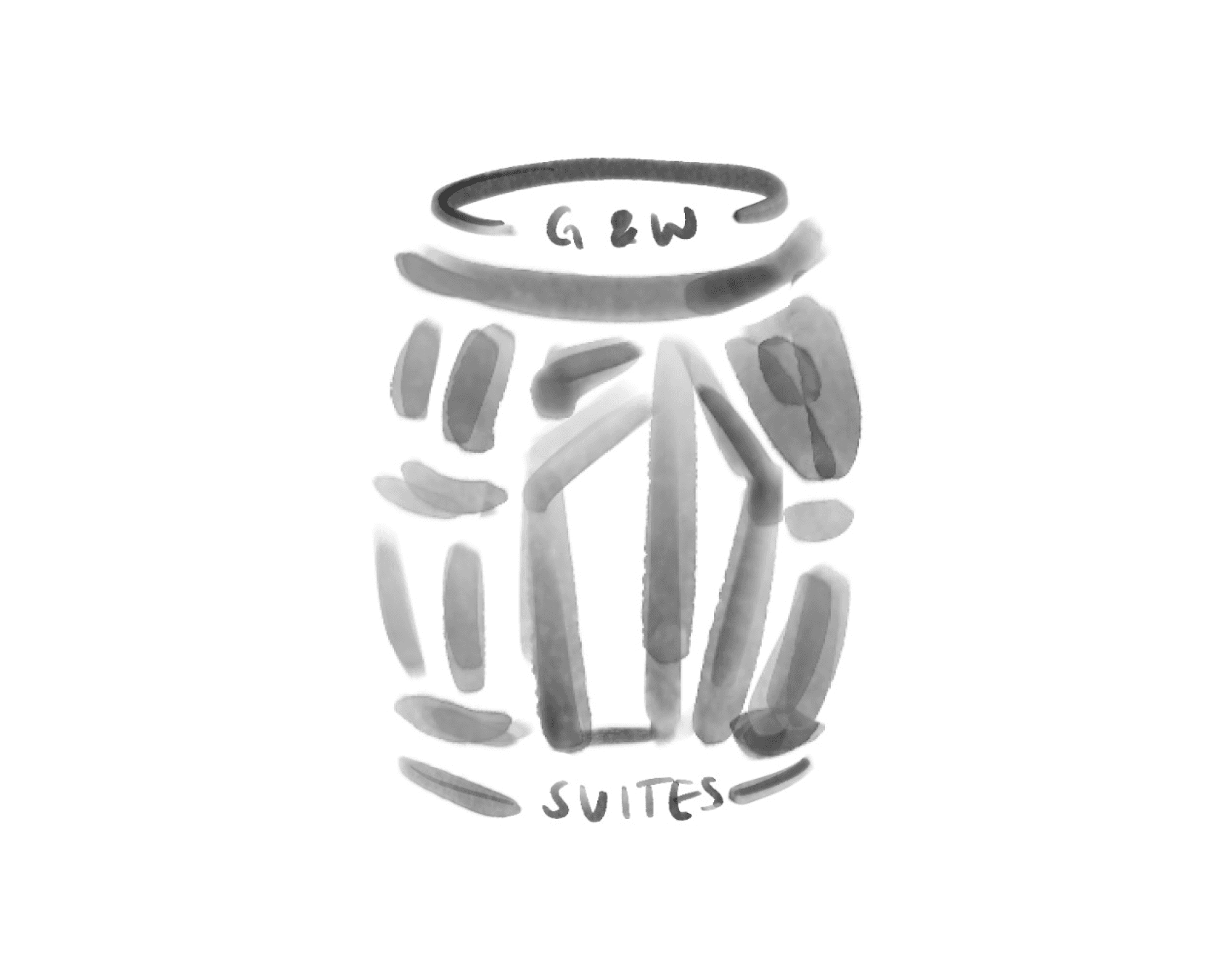
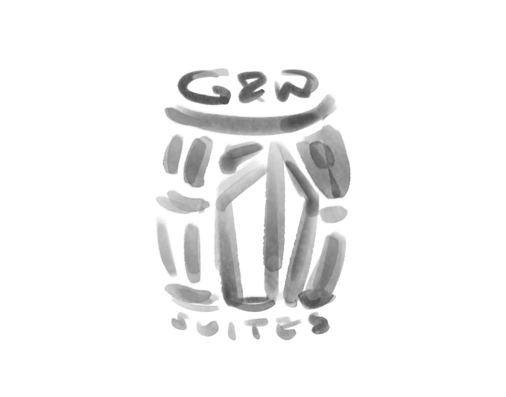
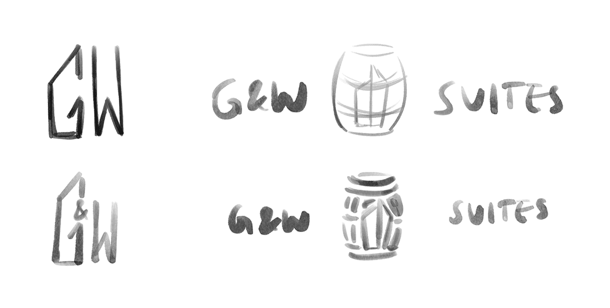
Stage 1 - Whiskey Barrel
In our initial sketch, the focus was to incorporate an aspect of whiskey imagery included on the moodboard. We decided on the whiskey barrel, as we felt it would be easiest to scale up and down while still being symbolic. We also wanted to include a building shape and the name of the building, whether that was inside the icon itself or off to the sides like a wordmark.
As we iterated, two issues emerged:
• The barrel details did not end up scaling well at smaller sizes as intended
• Simplifying the barrel made it harder to recognize the shape
Stage 2 – Building Focus
After receiving insightful feedback from our professor, we decided to shift our focus towards the building itself. We removed the text from the icon and began abstracting the architecture based on the image mock-ups of the building provided by our professor.
Although this direction moved away from our initial concept, it became a key turning point in the project. Instead of relying on literal elements, we based the brand direction on restraint and intentionality, ensuring the design was purposeful rather than being decorative.

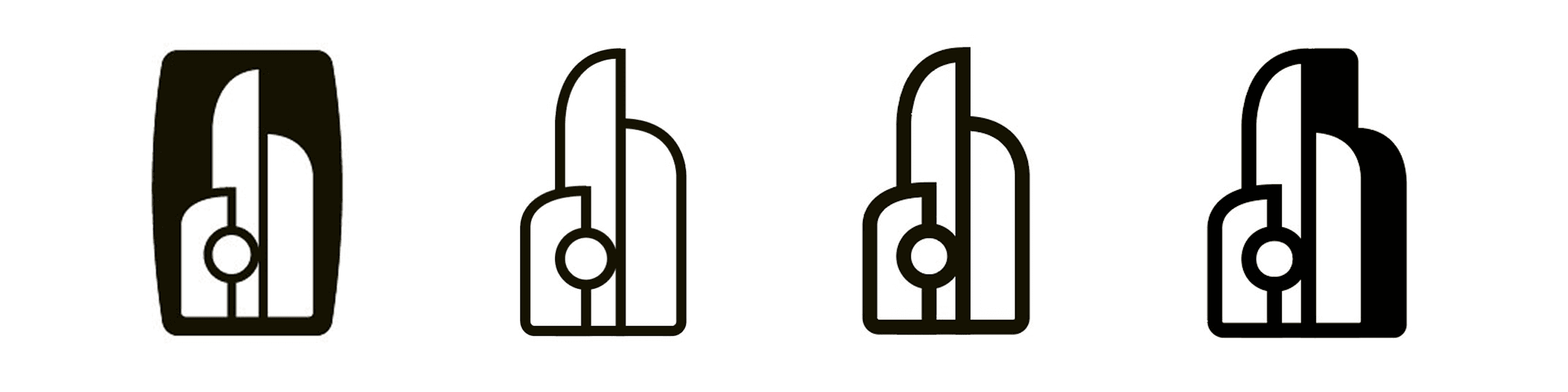
Stage 3 – Refinement & Depth
We continued iterating on the building shape, experimenting with:
• Line weight
• Negative space
• Perceived depth
The final logo features subtle dimensionality, reinforcing the idea of a physical, liveable space while also maintaining a clean, modern, and luxurious aesthetic.
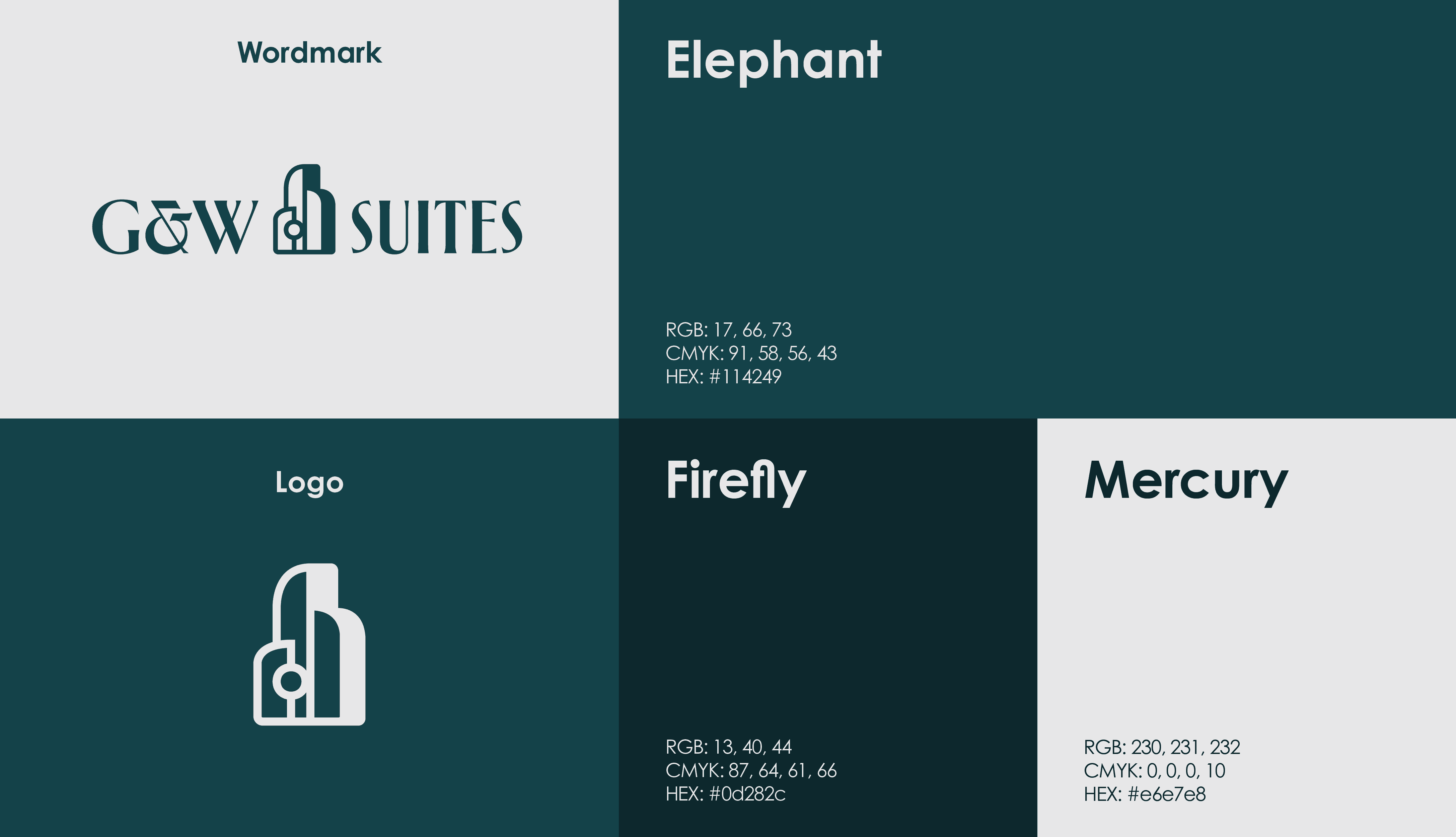
Final Brand Identity System
The final brand system encompasses a clean balance between contrast, legibility, and practicality. By using different design elements such as a restrained colour palette, minimal typography and consistent use of negative space, it positions the brand as a refined, urban residence.
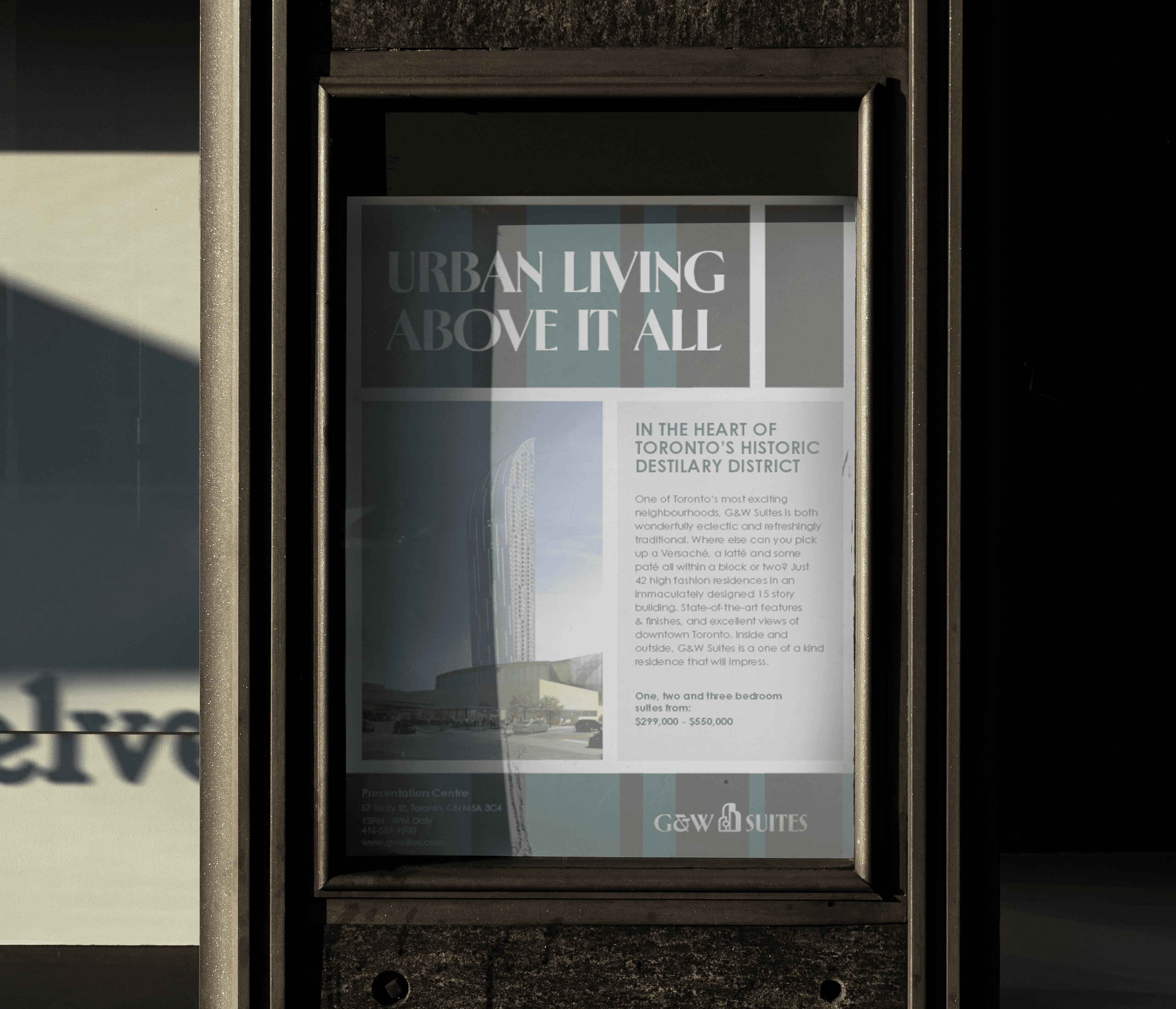
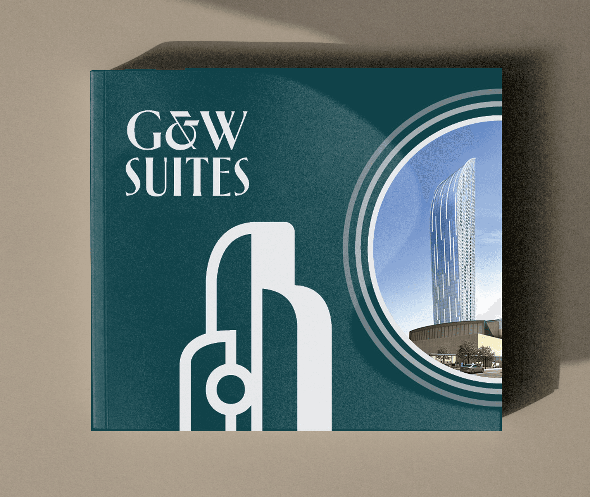
Print and Digital Applications
As a group, we created a full suite of deliverables to be used in the promotion of the new condominium:
· 8 page brochure
· Full-page advertisement
· Custom presentation folder using die-cuts
· Website wireframes and mockups
Each application emphasized hierarchy, readability, and consistency while also showcasing the architecture to appeal to potential buyers.


Reflection
This project taught me valuable lessons about:
• How to iterate based on critique
• Balance design objectives with creative freedom
• Design with print production constraints in mind
• How to work as a team efficiently and effectively
Outcome
Overall, the project was successful in establishing a unique condominium brand that feels modern and luxurious, while also tying in the theme and history of the Distillery District. Throughout the design process, it reinforced the idea that research is essential in guiding design decisions, even when that meant pivoting away from the initial concept.

